History of the Place
I led UX/UI and experience design for an interactive museum installation spanning mobile, touchscreen, and an AI-powered photo booth, delivered in 6 weeks, live on opening day
Role: UX/UI Designer
Timeline: 6 weeks
Platforms: Mobile / Touchscreen / AI-photo stand
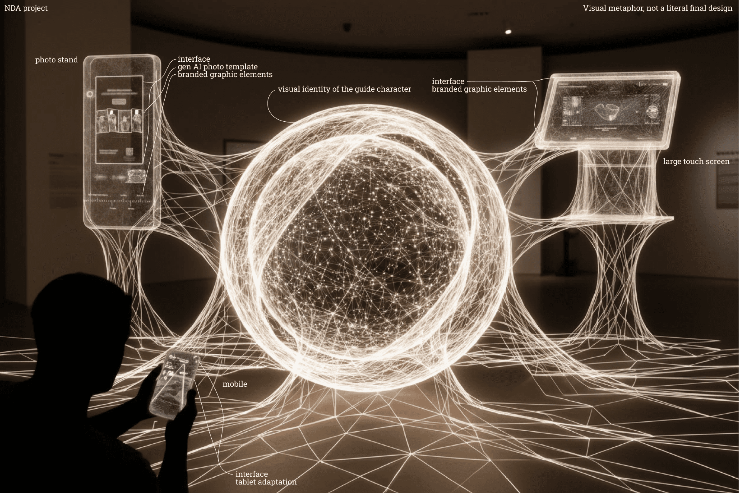
Context
The project was a brand activation inside a museum gallery, structured as a quest across three floors. Visitors moved between fixed interaction points using mobile, large touchscreens, and a final AI photo booth—all without staff guidance.
The installation had to work in a real public environment with continuous visitor flow, predefined physical placement, narrow gallery passages, strict brand guidelines, and content approval from museum experts
My role
I owned the full UX/UI direction: experience concept, spatial flow, UX flows across all three platforms, UI design and brand adaptation, AI photo templates, developer coordination, and client presentations
Result
The installation launched on the museum opening day and operated in a real public environment
6,000+
visitors engaged with the activation
5,000+
AI-generated photos downloaded
6 weeks
to deliver
Experience concept
The quest connected physical space and digital interaction into one continuous flow:
/Experience flow
Entrance → QR stand → Mobile quest → Touchscreen → AI booth → Download result
Each device had a distinct role:
mobile handled navigation and quest progression,
the touchscreen offered large-format content exploration,
and the AI booth delivered the personalized final output.
The challenge was keeping the experience coherent as users physically moved between floors and switched devices.
/Spatial flow

Visitor Journey
The experience was designed as a continuous flow across physical space and three digital surfaces.
Each stage had a specific role: entry, navigation, exploration, depth, personalization, takeaway.
/Visitor journey map
The quest structure meant visitors had to physically move between floors to progress. Navigation clarity was a core design problem, not a secondary concern.
Platform Breakdown
The experience ran across three surfaces. Each had a distinct role and required different design logic.
/DEVICE ROLE DIAGRAM
Mobile → Touchscreen → AI Booth → Mobile
Mobile: navigation and quest progression
Mobile was the thread connecting the entire experience. Visitors entered via QR scan and followed a fixed sequence across 5 stops. The UI used minimal elements and contextual onboarding so each step could be understood without reading instructions. A map and navigation hints were added after early review showed risk of visitors missing floors.
Fun fact! The QR entry points were originally planned as stickers, but were replaced with vertical screens to improve visibility in the gallery space.
Touchscreen: large-format story exploration
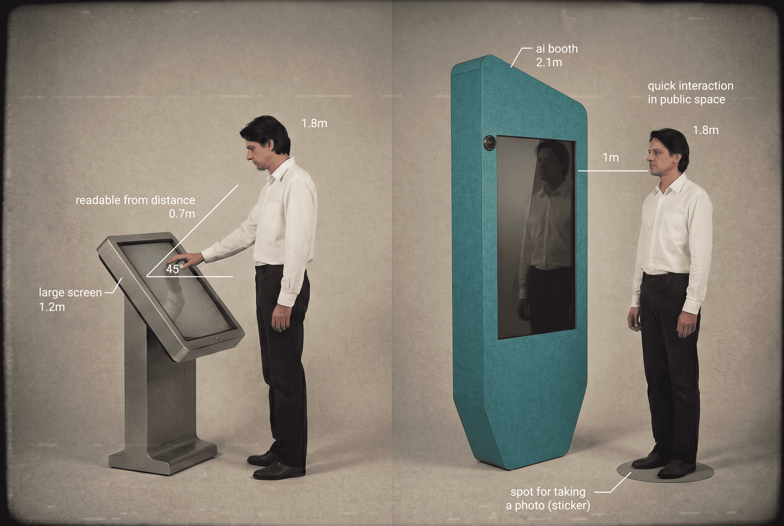
The 55" horizontal screen showed the same quest content adapted for distance viewing. Layout logic changed completely: controls in a reachable zone, text scaled for 0.7–1m viewing distance, media optimized for hardware performance. It also served as a recovery point for visitors who missed steps on mobile.
AI booth: personalized final output
The booth was the most complex interaction — combining physical capture with AI generation in a public space with no operator. The flow was designed as a short linear sequence:
/AI booth flow
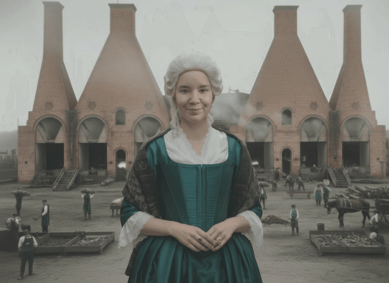
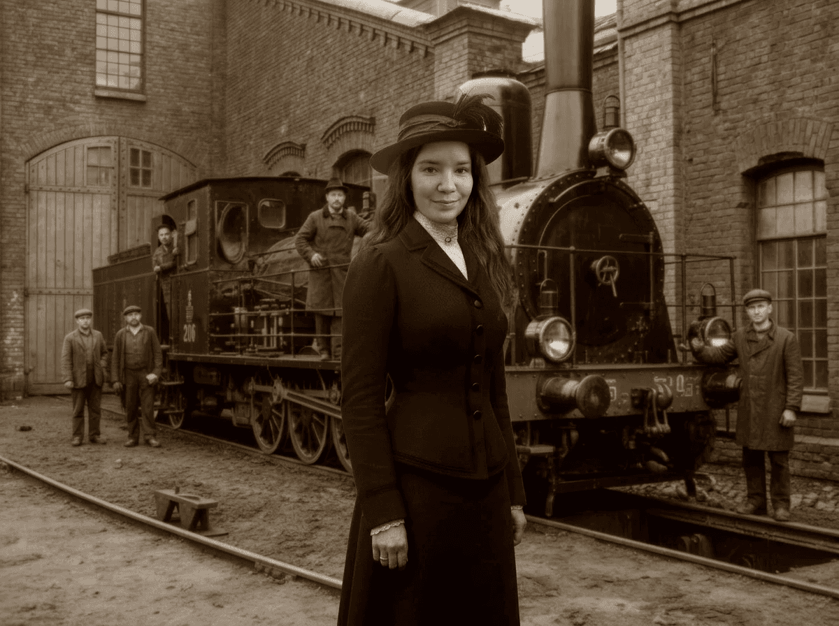
choose character and era → capture → generate → preview → download via QR
No branching, no ambiguity. Result delivered to mobile so the booth stayed clear for the next visitor.
Templates were predefined to ensure stable output and pass museum content approval.
/AI generated templates

Key Design Decisions
Design decisions were affected by real exhibition conditions: viewing distance, fixed placement, and visitor flow.
Interfaces had to remain readable on large screens and usable in narrow areas.
The diagrams below show how spatial constraints influenced the UX
/Interaction distance for large public screens
Some interaction points were placed in areas with limited visibility, narrow passages, or high visitor traffic.
To reduce the risk of missed steps or blocking the flow, navigation cues were added, entry points were made more visible, and onboarding was simplified
/Physical constraints affecting interaction design

Visual system / branding
The visual system followed strict brand guidelines while fitting a dark exhibition space.
UI was adapted for different devices while staying consistent and readable on large screens.
The design balanced client’s brand rules with usability
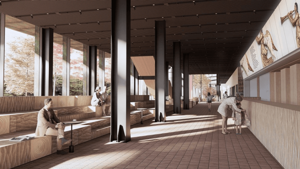
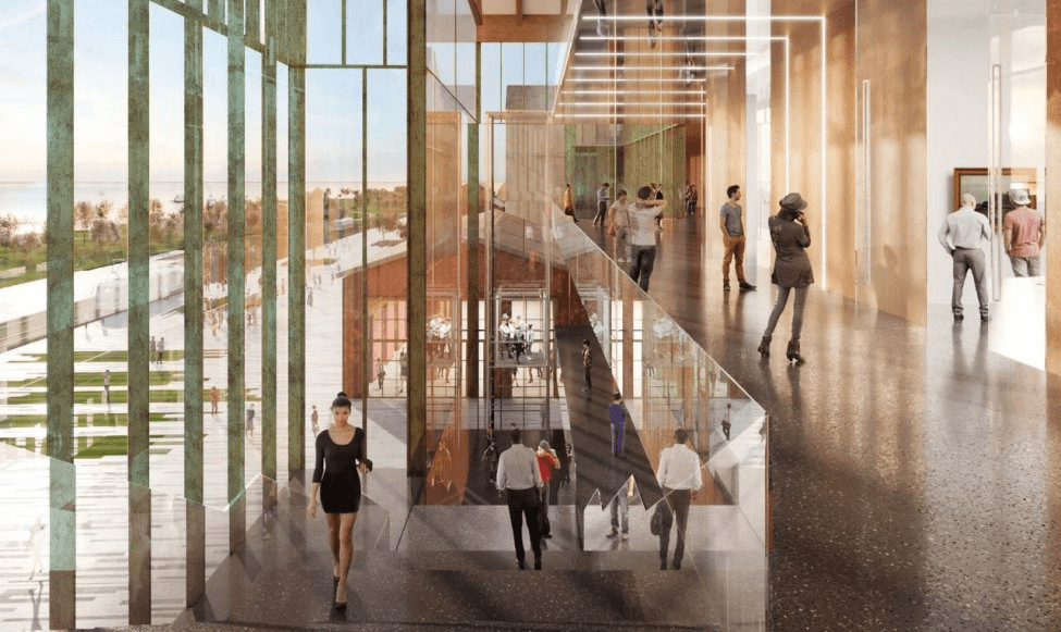
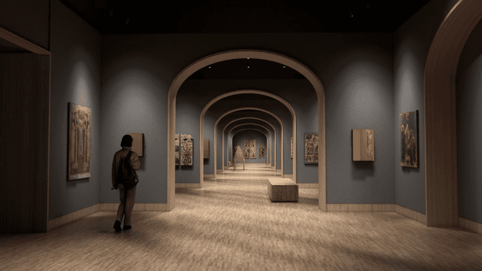
/renders. 1-wardrobe. 2-stairs. 3-halls
Delivery under deadline
The project was delivered in 6 weeks, including design, development, and hardware setup.
Mobile, touchscreen, and AI booth were built in parallel.
Some decisions were refined after launch due to limited testing time
Week 1
UX+concept
Week 2
UX+UI
Week 3
UI+AI templates
Week 4
AI templates+DEV
Week 5
fixes
Week 6
tests+launch
...and to be honest:
Week 7
fixes...and new AI templates
Reflection
Working on this project reinforced how strongly physical space influences UX decisions.
Designing across mobile, touchscreen, and a AI booth required keeping the experience consistent, even when the same interaction had to be adapted for different screens.
The tight timeline also required making decisions quickly and validating them in real conditions rather than through a full design cycle.
Next time I would simplify content layouts earlier to keep interaction focus clear